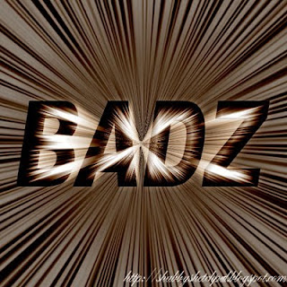
For once, I wanted to do something about text. Simple font like Arial can look cool too. My first thought was to make the text looked like zooming fast. By using a couple of filters, this can be done. Before doing anything, we needed to make sure the canvass was a perfect square, because there would be a lot of rotating. Less than perfect square would make the end result a little weird.
First I typed a short word with Arial Black. Then I duplicated the layer and filled the duplicated layer with white on multiply blending option. I blurred it a little with 2 pixels Gaussian. At this stage, the text would look rather plain.
How to make it not so plain. Hit filter, find distort and find polar coordinate. Check the option polar to rectangular. See the difference? Rotate it 90 clockwise. Hit another filter. This time, it's stylize, the wind effect. Make sure to pick wind method and direction from left. Do this twice, then we'll have a bunch of scratch marks. Then hit Ctrl+I to invert the color. Do the windy twice, again. We'll have a blackboard with white scratches. That's fine. Rotate it 90 counter clockwise. Still not getting it, eh? Try the previous filter, polar coordinate. Pick rectangular to polar option. Now we're getting somewhere. For this layer, choose hard light for blending option. Adjust hue/saturation as you like. See? A lot cooler than simple type.
If it's still not enough, make another layer. Fill with white and add 100% Gaussian monochrome noise. Use motion blur with direction 90 degrees, and distance 200 pixels. Hit polar coordinate again and choose rectangular to polar. Again, pick hard light blending mode. See?
Oh, but text becomes unclear. We need to add layer mask on this and brush the areas we want to make clear with black. If the zoom lines is too strong for your taste, just reduce the opacity of the layer. Done.

No comments:
Post a Comment